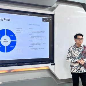
Data visualization enhances the effectiveness and organization of presentations. Many data visualization techniques are available, ranging from simple text line graphs to extensive charts. The selection of the appropriate type of data visualization should align with the specific needs and objectives of the presentation.
This was conveyed by Muhammad Ishla Fakhri, Head of Market Research and Analysis at Telkom University, during a seminar held in Amphitheater Room 1, MBA Building, SBM ITB, on Monday (14/7). The seminar aimed to enhance students’ understanding of data processing, particularly for writing their final semester theses. Fakhri, who has extensive experience in data processing and project management, shared valuable insights.
Fakhri emphasized the importance of careful attention to color usage in graphs to facilitate easier reading and comprehension. He also noted that certain data visualizations, such as pie charts, donut charts, and Y-coordinate graphs, are best avoided for presentation purposes.
In addition to data visualization, it is crucial to consider visual perception and how readers interpret the presented data. Applying Gestalt principles can help make data visualizations more comprehensible.
Key attributes in data visualizations should be displayed more prominently to guide readers’ focus. This can be achieved through specific colors, bold or italic fonts, varying font sizes, spatial separation of words, and other equivalent techniques.
Fakhri also discussed the pyramid structure approach to data visualization. This approach can be either top-down or bottom-up, depending on the purpose of the visualization.


